Lead UX/UI Designer (Gamification & Design System)
Prodigy Baby Gamification UX/UI Case Study
Project Overview
Prodigy Baby is a child-development and learning app designed for kids and their parents. The goal was to introduce gamification into the learning journey while keeping the experience:
-
Simple for millennial parents
-
Playful and engaging for kids
-
Visually delightful yet functionally clear
I was approached directly by Mukesh (CTO, Raising Superstars) to solve the gamification and experience layer of the product.
Problem Statement
While the app had strong learning intent, it faced major UX challenges:
-
Low engagement & motivation
-
Poor visibility of progress
-
Screens felt functional but not delightful
-
No clear reward-feedback loop
-
Parents needed clarity, kids needed fun
The biggest challenge:
How do we make learning feel like a game without making it confusing for parents?
Platform
Mobile App (Parents + Kids Ecosystem)
Role
UX/UI Designer (Gamification & Design System)
Research & Discovery
My Role & Responsibilities
Guiding the visual experience from UX Research and founder alignment, I design and scale comprehensive Design Systems using iterative, gamified user flows and high-fidelity wireframes.
Gamification Study
I studied:
-
Duolingo
-
Prodigy Math
-
Kids finance apps
-
Habit-forming apps (streaks, points, rewards)
Key insights:
-
Kids respond to visual rewards
-
Parents trust clear data & reports
-
Micro-animations increase retention
-
Colors influence engagement dramatically
Founder’s Taste Analysis
I analyzed:
-
Reference apps shared by the founders
-
Preferred UI tone:
-
Friendly
-
Colorful
-
Soft shadows
-
Minimal cognitive load
-
Work
Bringing Gamification + Motion as Core UX
After multiple discussions with stakeholders, 3 strategic directions became clear
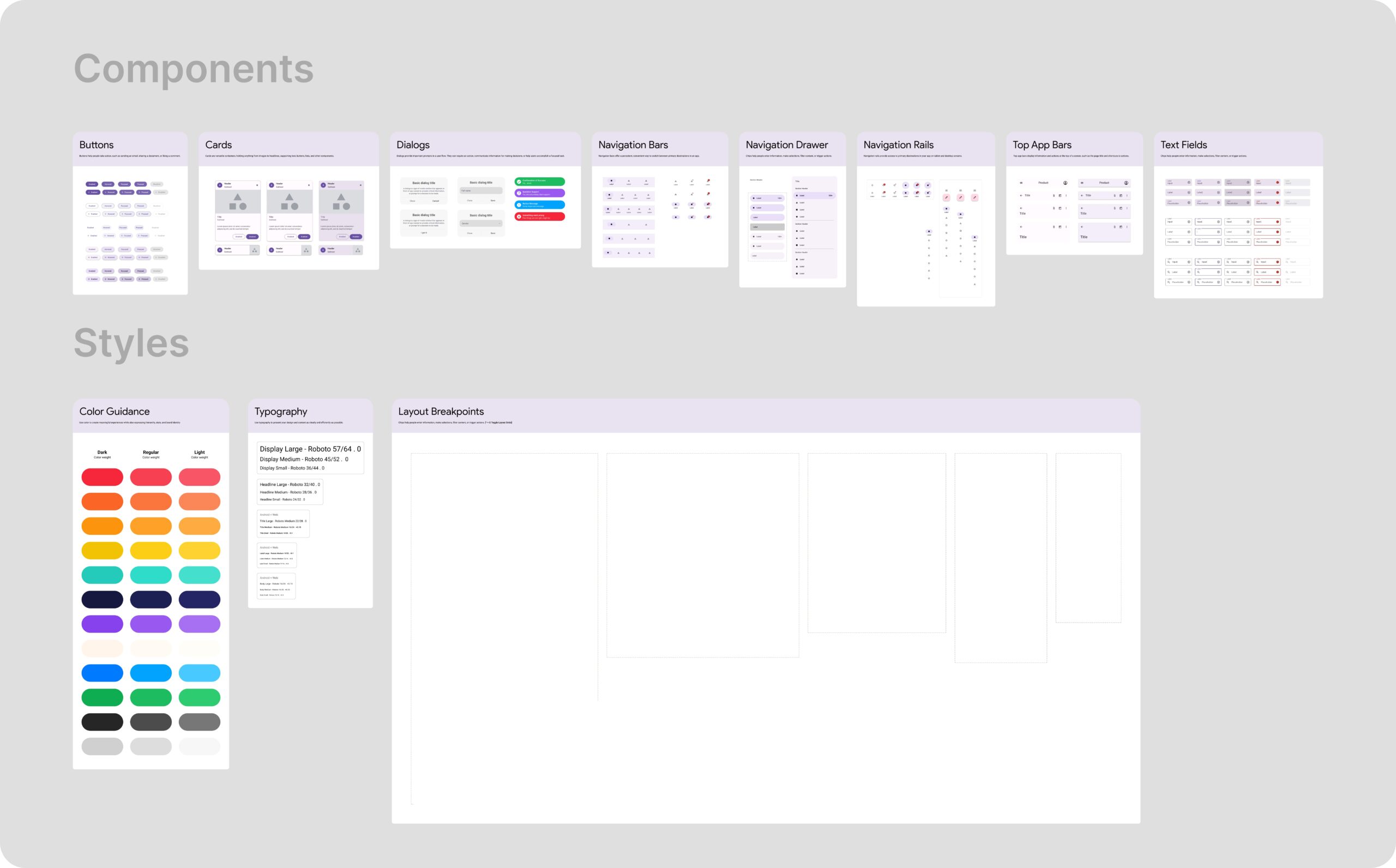
Design System Creation
Before touching screens, I built a full design system for long-term scalability:
Components
-
Buttons
-
Cards
-
Dialogs
-
Navigation Bars
-
Drawers & Rails
-
Top App Bars
-
Text Fields
This allowed the team to
-
Build faster
-
Maintain visual consistency
-
Scale future features easily
Styles
Color Guidance for:
- Rewards
- Alerts
- Learning progress
Typography for:
- Kids readability
- Parent clarity
Layout Breakpoints for:
- Mobile-first scaling
UX Strategy - Gamification Layer
We introduced:
-
🪙 Coins & Points System
-
🔥 Streak-based motivation
-
🎯 Task-based rewards
-
📊 Progress visualization dashboards
-
🛍️ Reward redemption screens
All of this was structured so that:
- Kids feel excited
- Parents feel in control
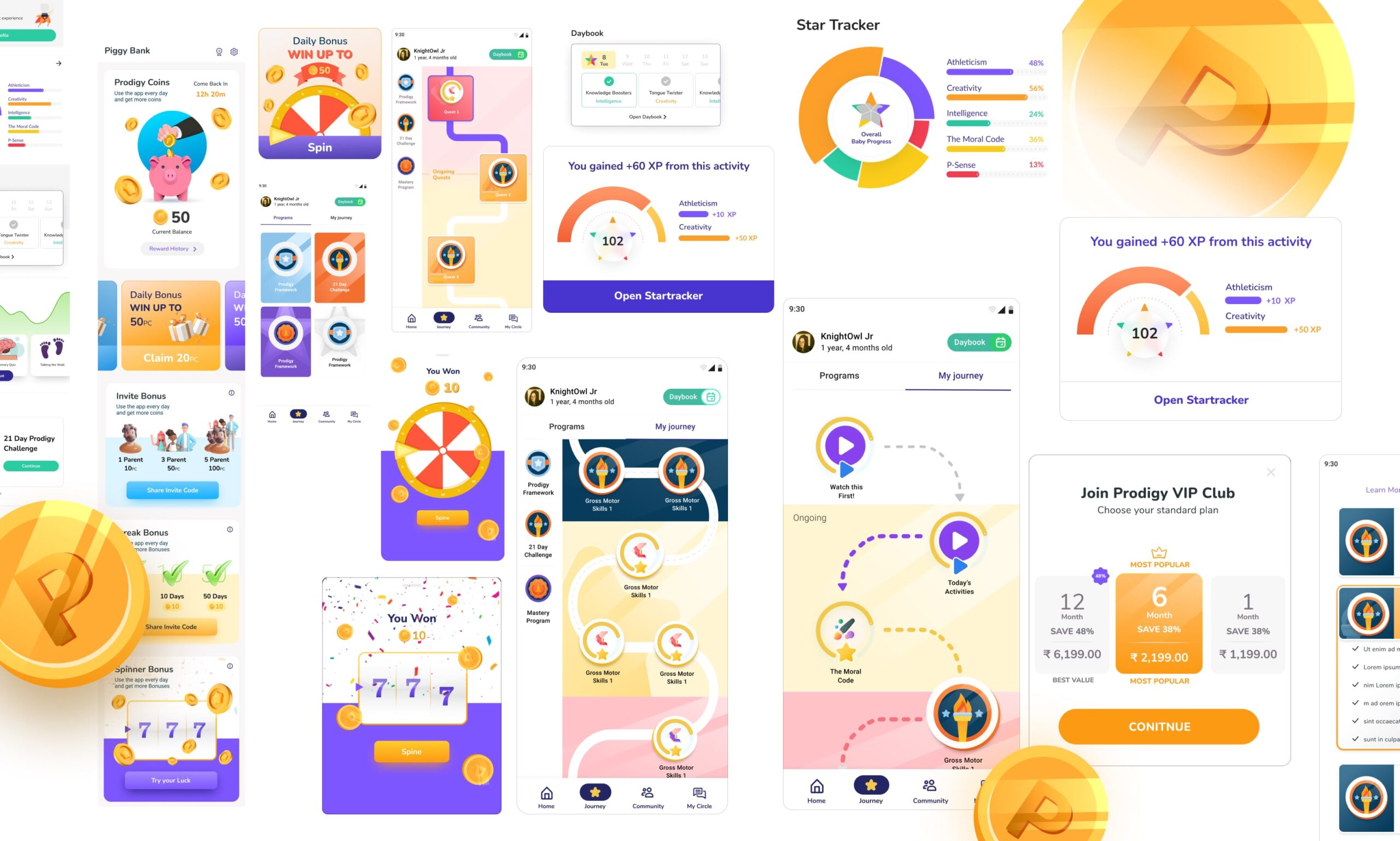
Wireframing → Visual Refinement
I followed a reinforcement learning–style iterative approach:
I followed a reinforcement learning–style iterative approach:
- Low-fi wireframes
- Founder feedback
- UX correction
- Visual upgrade
- Micro-interactions pass
- Revalidation with use cases
This constant back-and-forth helped us fix:
- Visibility gaps
- Confusing game mechanics
- Parent-child flow mismatches
The app was built using Flutter and Dart, where I applied my knowledge of QLAN.
Curious about QLAN? Explore my case study to see how it works in action.
Impact
Final Outcomes


Learnings
-
Gamification is not about adding points, it’s about psychology
-
Kids need instant feedback
-
Parents need trust & clarity
-
A strong design system saves months of chaos
-
Founder taste alignment is as important as UX logic